
Brand Case StudyWildflower Ridge Farm
00
OVERVIEW
Wildflower Ridge Farm
Brand strategy, visual identity, packaging, launch toolkit
Question
How do you turn a loved local farm in the Orara Valley into a benchmark for Northern New South Wales provenance?
Answer
We built a proof-first brand that scales intimacy, not production – turning one ridge, one family and one herd at a time into a visible mark of quality.
Outcome
A complete brand and packaging system that makes provenance legible on every product, every market stall and every story coming out of the ridge.

01
project
overview
A new mark of Orara Valley excellence
Client & Context
Wildflower Ridge Farm is a family-run farm in the Orara Valley, Northern NSW, raising grass-fed beef, pastured pork and handmade cheese on an intimate, hands-on scale. Locally, the farm is trusted: regulars at the markets, chefs and bakers who know the family, word-of-mouth that travels faster than any campaign.
Beyond the valley, it was a different story. Wildflower Ridge looked and sounded like just any other “premium” meat brand in a category full of vague claims and rustic clichés.
Ambition
Turn a loved local farm into a clear benchmark of Northern New South Wales provenance.


02
challenge
Turning quiet credibility into a standout premium brand
Wildflower Ridge Farm was operating in a crowded premium farmers’ market where the loudest stories were about luxury, exclusivity and glossy chef endorsements. As a small family producer on a ridge in Orara Valley Northern NSW, they had outstanding product and genuine community trust, but no clear way to signal their quality, justify a premium or stand apart from “just another ethical farm”.
The challenge was to turn quiet, word-of-mouth credibility into a distinct brand that could champion intimate-scale, provenance-led farming without slipping into the same old rustic-farmhouse clichés.
Challenge
In premium meat, everyone talks about provenance “grass-fed, local, sustainable”, but few brands can show what that actually means. Premium often still looks industrial. Rustic clichés and heritage scripts blur together.
Despite independently graded MSA Top 10% beef and a genuinely intimate farming model, Wildflower Ridge looked and sounded like everyone else. The reality, every animal known, every season measured, every customer recognised, was invisible.
So the brand had to solve one thing:
Close the gap between “trust us” and “here’s the proof.”
03
Insight
Modern food is full of stories. Our customers are done buying stories. They want proof.
Audience insight
This audience already believes in good food, good farming and “doing the right thing”. Their frustration isn’t a lack of narrative, it’s too much narrative and not enough substance. They’ve been let down by premium claims that don’t eat like premium and certifications they don’t fully understand.
Opportunity
Make Wildflower Ridge Farm the quiet brand that says less, proves more – and gives people a simple way to show why this meat deserves pride of place at the table.


04
Positioning
& Brand Idea
The strategic leap
Positioning
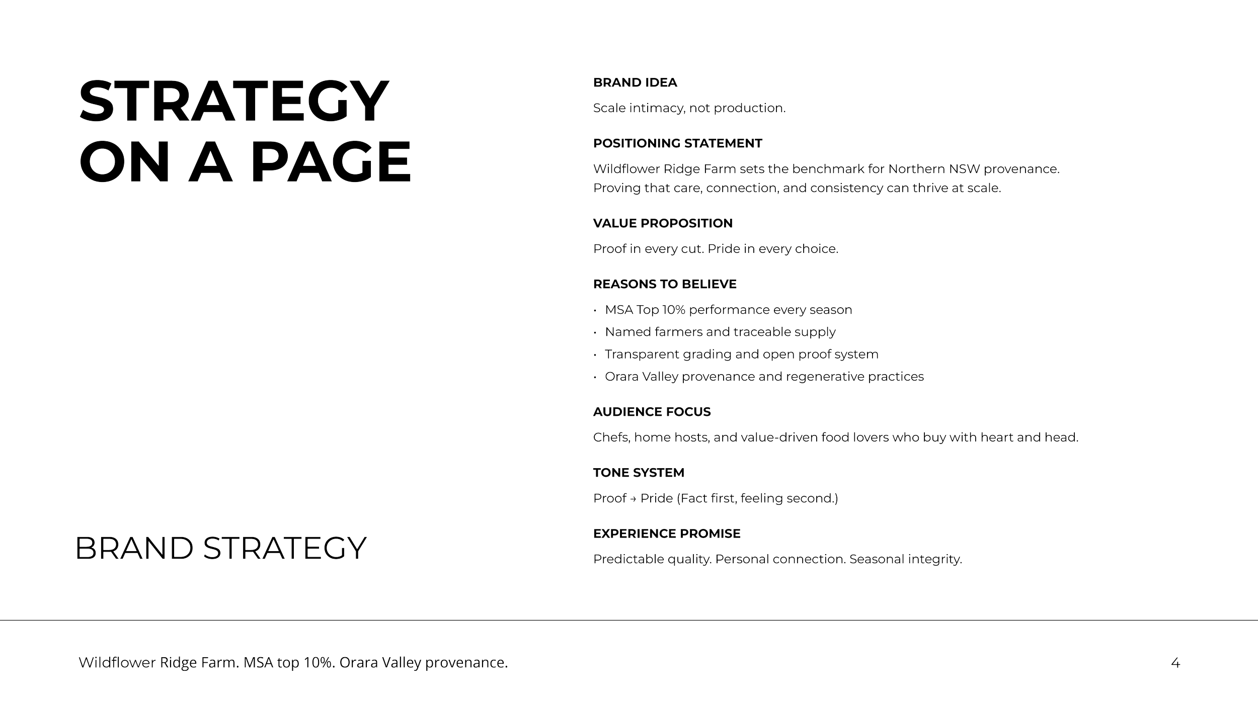
Wildflower Ridge Farm is the benchmark of Northern NSW provenance – proving that care, connection and consistency can thrive at small scale.
Brand Idea: Scale intimacy, not production.
Instead of chasing industrial growth, Wildflower Ridge doubles down on depth. Every animal is known, not just counted. Every season is measured, not just endured. Every customer is invited into that relationship.
The brand exists to turn intimate-scale farming into something you can see and trust: proof in every cut, pride at every table.
05
Brand
pillars
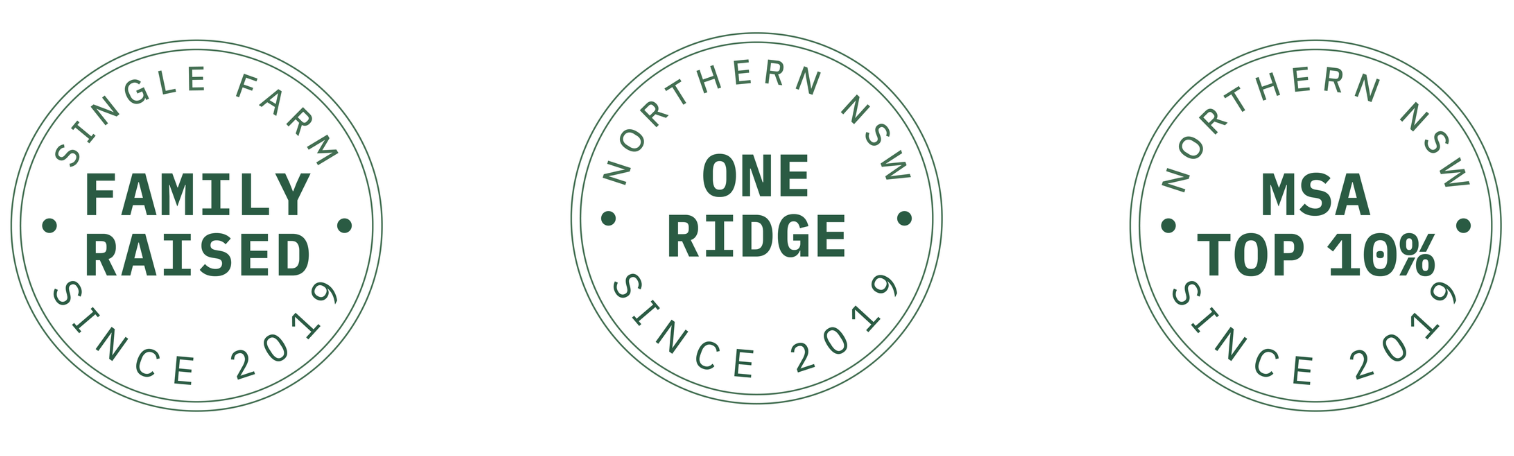
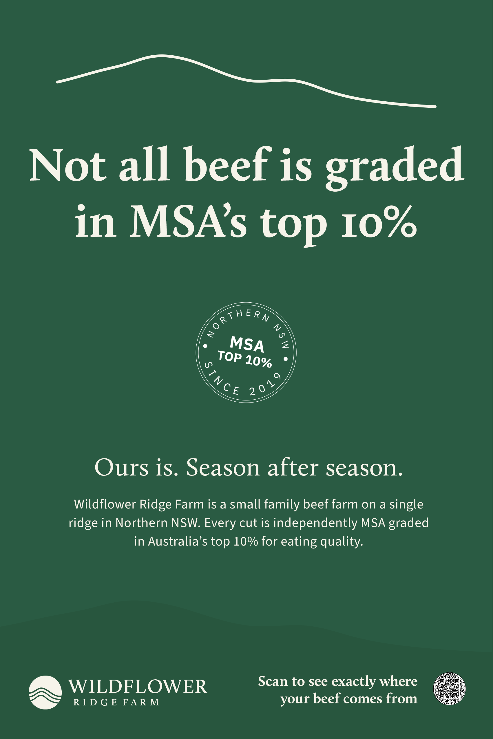
1. Measured Excellence
Proof beats claim. Independent MSA Top 10% grading and a clear proof system put fact before story. Every pack and touchpoint is treated like a small spec sheet:
Cut, grade, ridge, season.
Badges, seals and batch details you can actually read.
A quality system that’s legible to non-experts.
2. Known Hands
Someone real to trust. This is a named, family-run farm, not an invisible supply chain. The brand keeps the relationship front and centre:
Farmers are named and visible.
The ridge itself is treated as a character.
Language and imagery always connect product back to specific people in a specific place.
3. Seasonal Rhythm
Scarcity turned into anticipation. Wildflower Ridge doesn’t fight seasonality; it brands it.
Seasonal drops and small runs follow the land, not the spreadsheet.
Each season becomes a story from the ridge. Something regular customers can look forward to.
Availability feels like an occasion, not a frustration.
These pillars show up in the identity, the language and every proof element on packaging and at the market stall.
06
Tone
of voice
How it sounds
Tone of Voice: Proof, then pride
The tone system is built on one rule: lead with something you can measure, follow with the feeling it unlocks. Start with a fact – grade, origin, ridge, season, herd. Then let a calm, human line carry the emotion. No hype, no begging for belief. Just earned confidence.
Before
“Beautiful, premium grass-fed beef from Northern NSW.”
After
“MSA Top 10% beef from one Northern NSW ridge. Proof in every cut.”
More examples
“One ridge. One family. One herd at a time.”
“From paddock to plate? Closer. From this ridge to your table.”

07
Visual
territories
From strategy to visual territory
A custom GPT trained on the strategy was used as a sparring partner to name visual territories and suggest imagery for each pillar. Three visual directions were then translated into hand designed moodboards, turning abstract positioning into concrete, art-directable routes.


08
logo
Logo concept
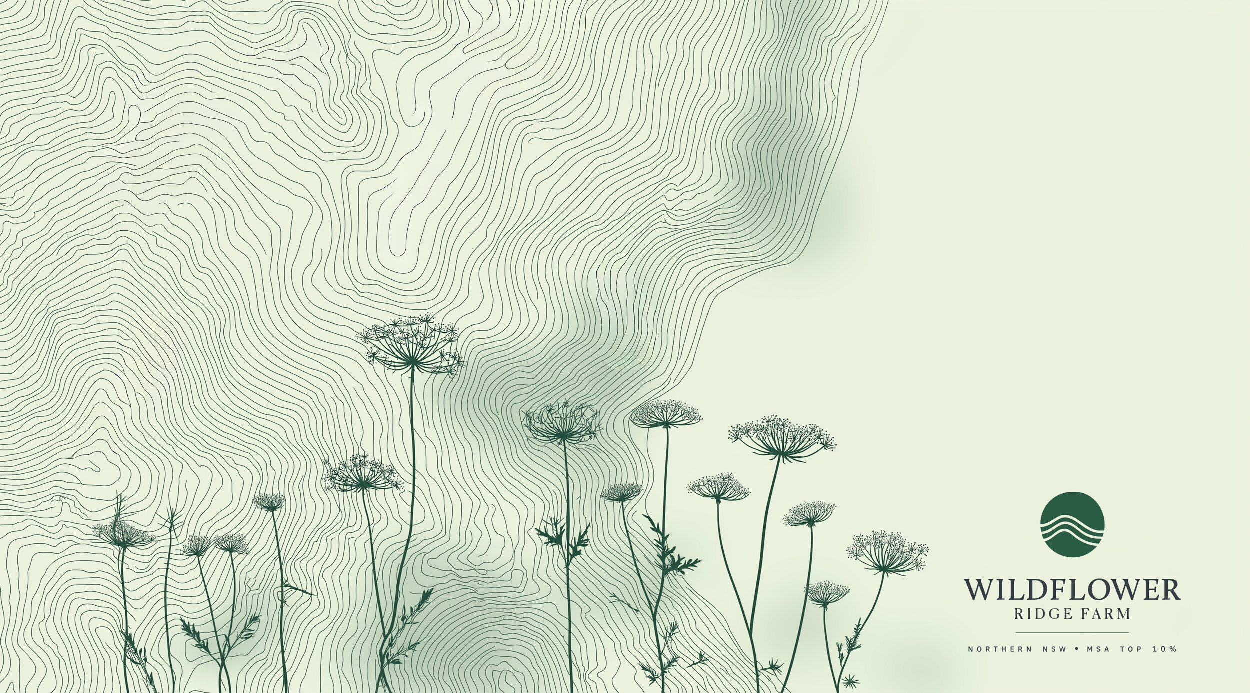
The logo is a simple, confident seal of origin. A circular mark holds three stepped contour lines representing the ridge itself – a reminder that the land shapes every animal raised there. Paired with the Calluna wordmark, it balances rural warmth with measured confidence and scales cleanly from pack seals to digital favicons.
09
Visual
Identity
The proof is in the design
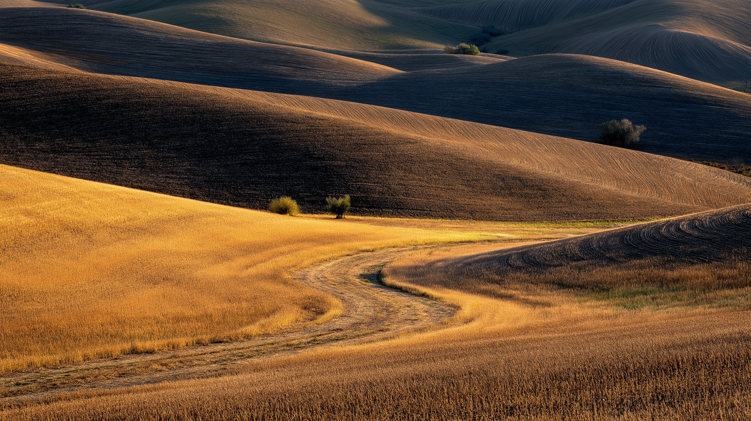
Concept: The land makes the brand
The identity treats Northern NSW as the spec sheet for quality – not just a backdrop. Contour lines trace the ridge and become a quiet supergraphic across packaging, labels and posters. They frame batch details, coordinates and grading, so every piece of design feels like it’s been lifted straight from the land.
The visual system connects the big idea, proof, intimacy, the ridge, to specific design choices: contour lines, seals, typography and colour. Nothing is decorative for the sake of it. Every element has a job: to make provenance visible, build trust at a glance and keep the whole brand feeling calm, premium and from one real place.
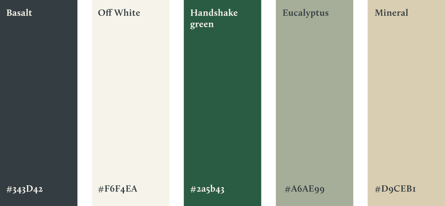
Colour Palette
A mineral, ridge-born palette lifted from the Orara Valley – grounded tones that avoid “farm fresh” clichés and make provenance feel measured, not marketed.
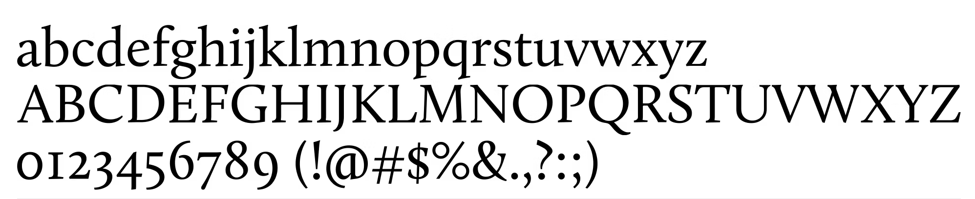
Typography
Calluna, a warm humanist serif, paired with a clean engineered sans. Headings feel human and grounded; data feels precise.
Seals and grading marks
Circular proof stamps and grading marks make MSA quality legible to non-experts and turn claims into something you can literally point to and audit.
10
LAUNCH
CAMPAIGN
Closing the “mystery meat” gap
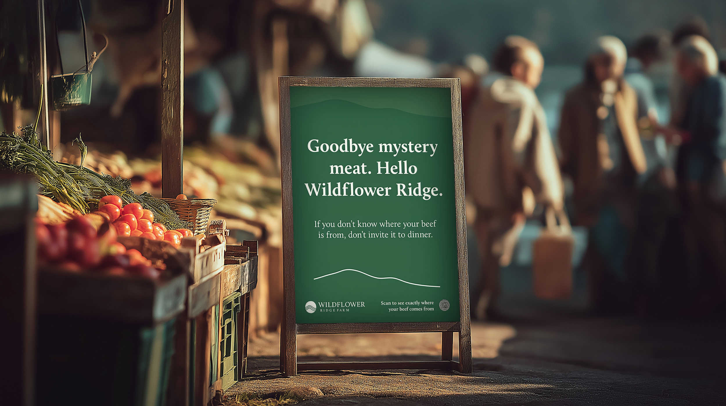
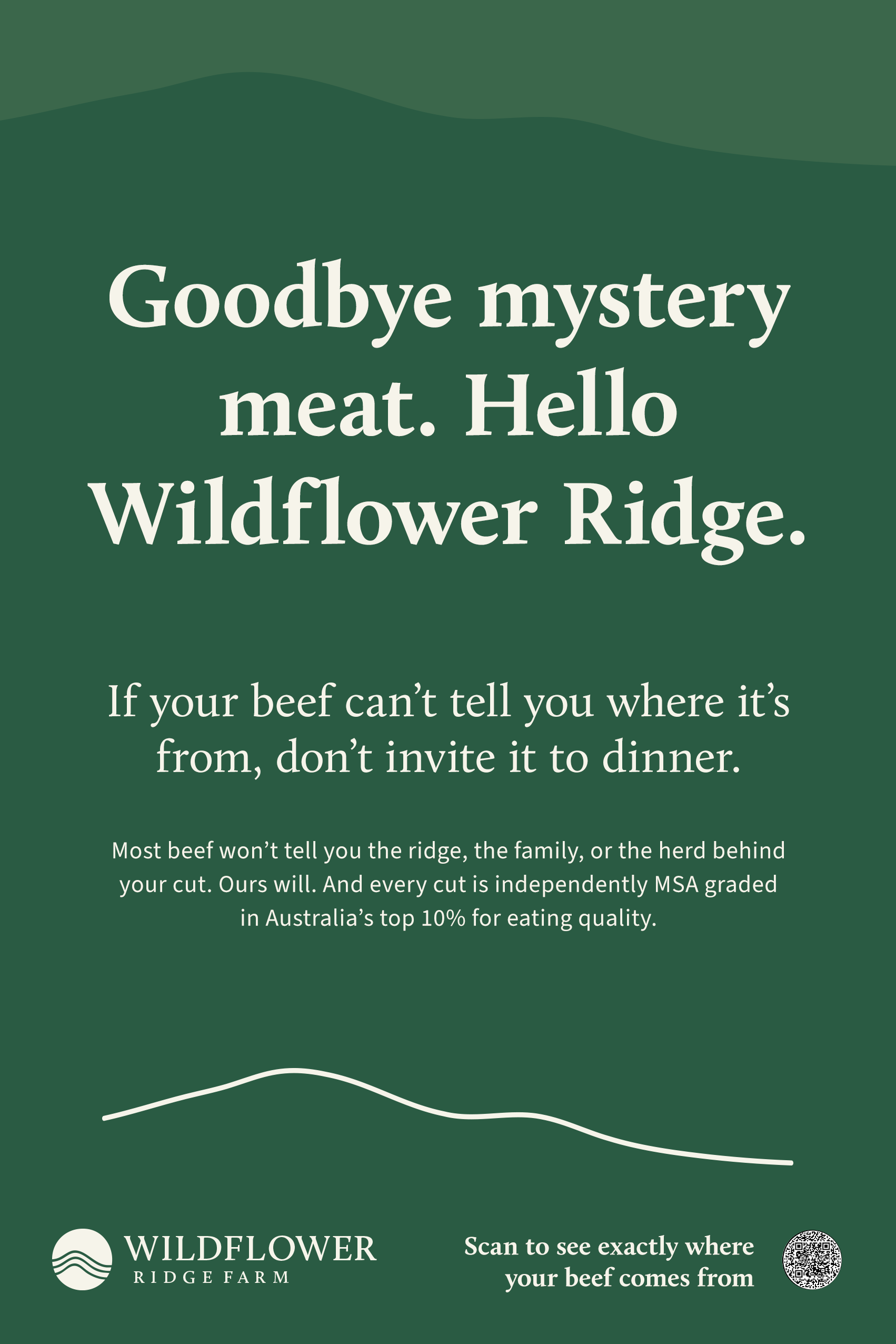
Problem
Buying meat from supermarkets often feels like buying “mystery meat”, vague provenance, anonymous producers, no way to tell what’s behind the label.
Approach
Use everyday anxieties about anonymous meat and answer each one with proof from the ridge, grading, herd and hands.
Idea
Every touchpoint from market stall posters to tray labels, closes the gap between “We say it’s good” and “Here’s how you can see it for yourself.”


11
Market
Stall
Field office for provenance
Objective: turn a farmers-market stall into a calm, premium provenance desk.
Ridge contours and the circular seal create a consistent, minimal environment. Proof seals, coordinates, ledger-style information, repeats across signage, labels and price tags. The stall looks less like a rustic market table and more like a small field office, where every question about quality has an answer. Buying meat feels like stepping into a relationship, not just a transaction.

Visuals prototyped with Adobe Firefly and refined in Photoshop.
12
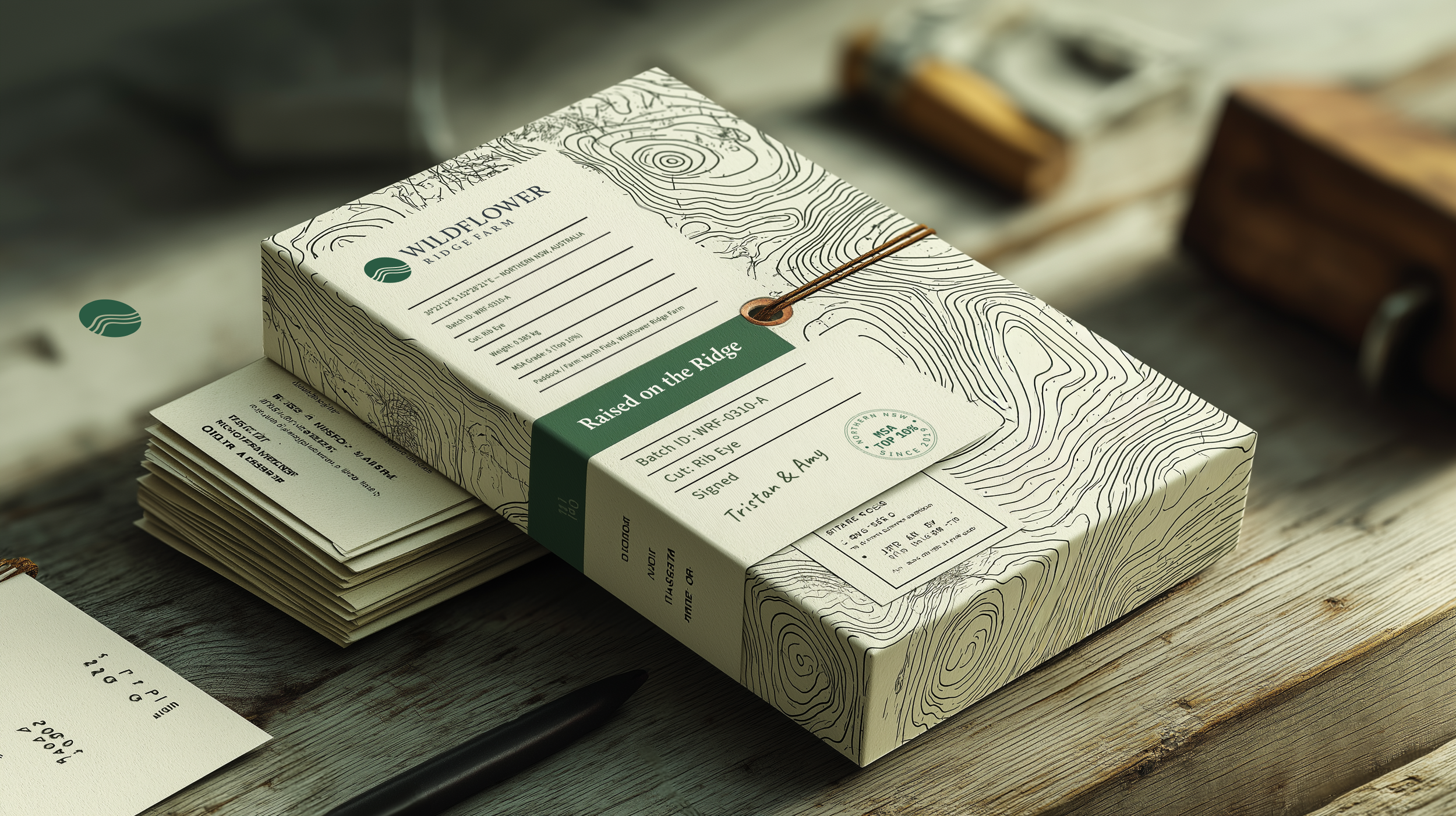
Packaging
The ridge in your hands
Idea: make every pack feel like a certified excerpt from the ridge.
The contour-line supergraphic wraps each tray like a topographic map. The front-panel “proof stack” reads like a mini spec sheet: cut, grade, ridge, season. Seals and grading marks turn abstract MSA scores into something you can point to and understand.
From shelf distance, you see calm structure and a Northern NSW signature. Up close, you can literally read why this cut deserves its place at the table.

Mock-ups created in Midjourney. Hand finished in Photoshop.


Midjourney experiments for the contour wrap
13
brand
roll
ouT
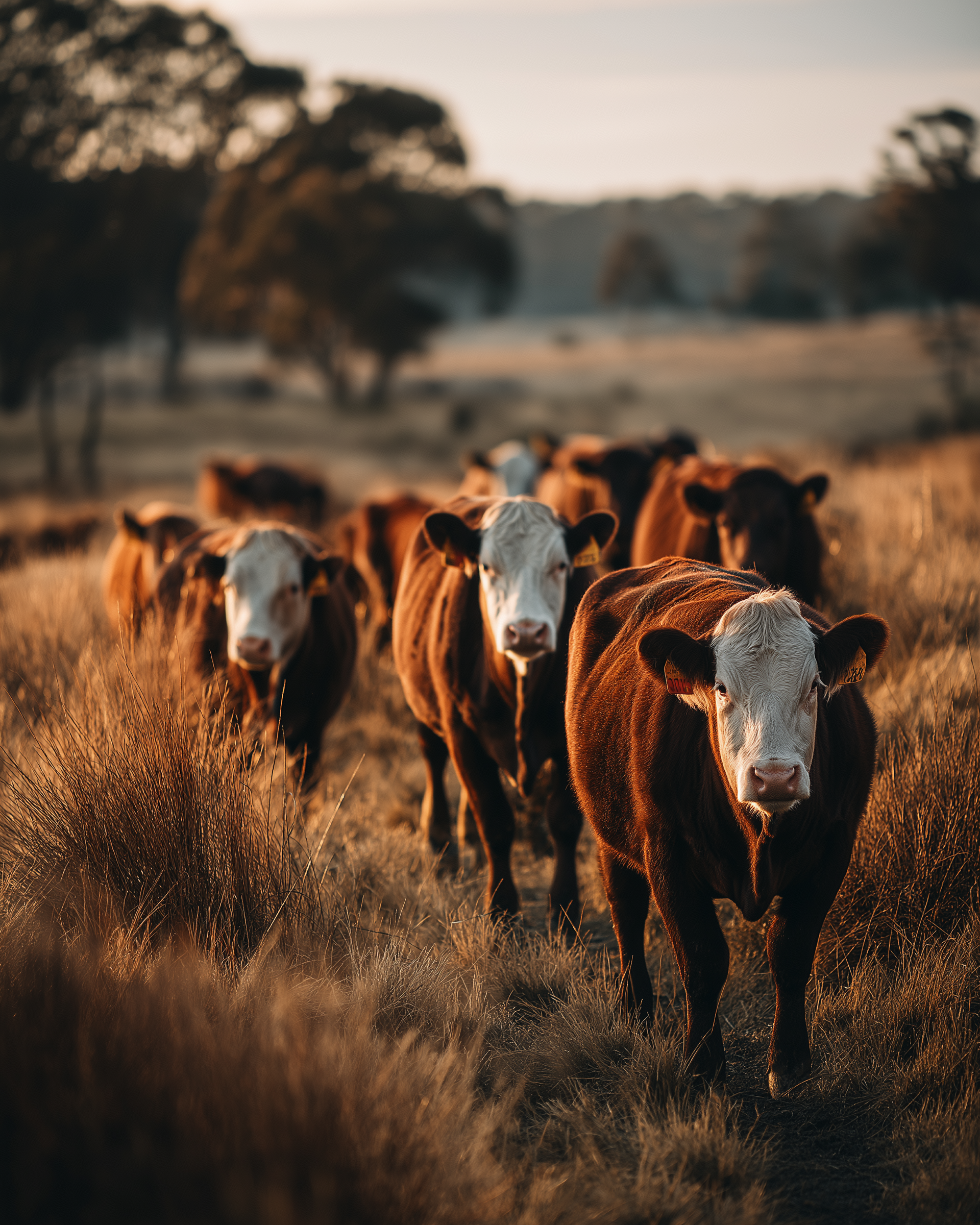
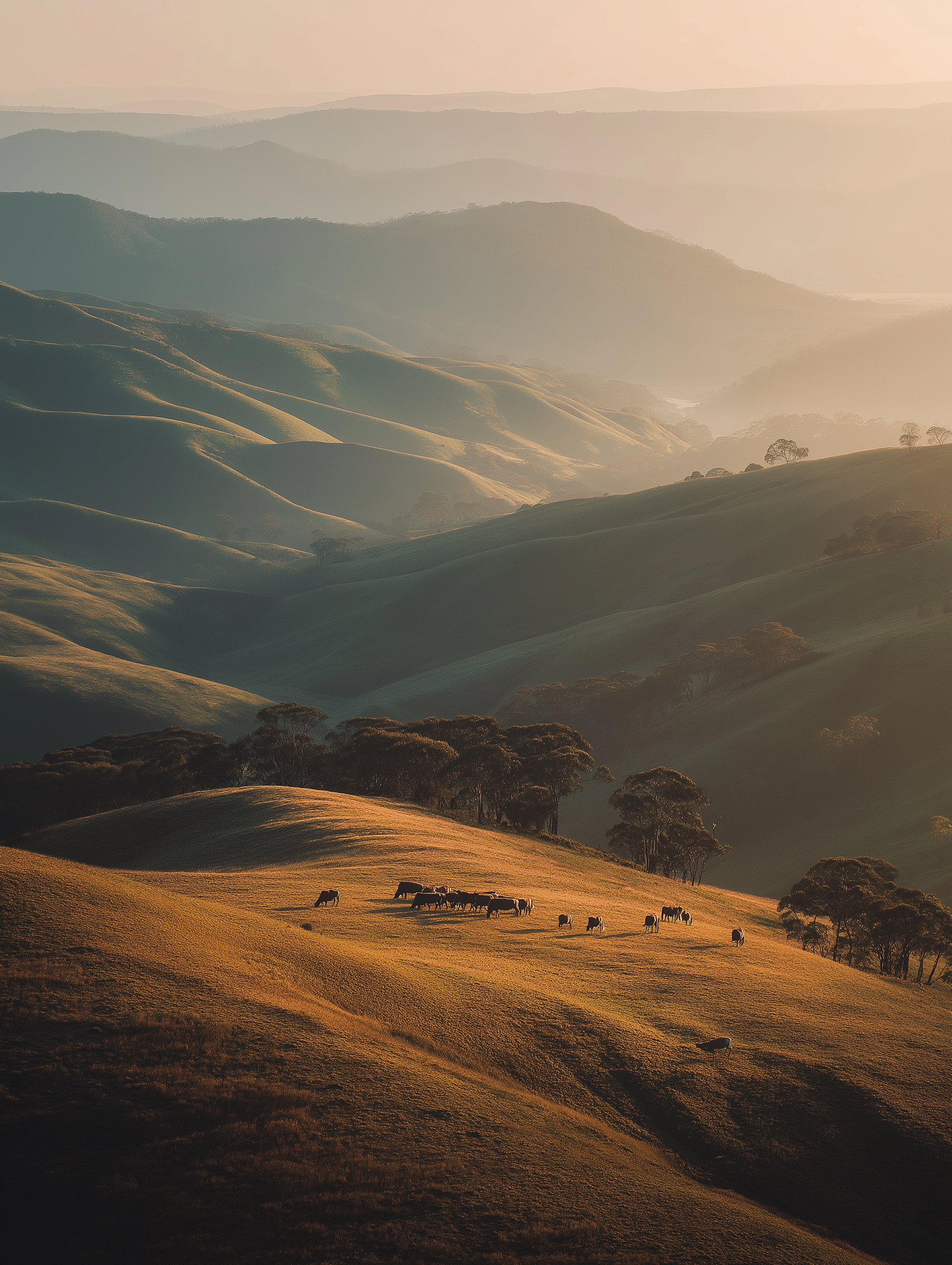
Brand Imagery
Calm, premium images that make provenance the hero. We lead with Land → Herd → Hands. Documentary-first, editorial-clean. Proof shows up quietly, so trust is visible without theatrics. Light is golden hour or bright overcast; compositions use low horizons and negative space.


14
MOTION
Motion strategy
Motion treats the green circle logo as an origin point and the land as something that radiates out from it. Thin contour lines draw from the mark and drift across layouts like topographic rings, revealing imagery, copy and proof as they pass. Used in logo stings, section transitions and provenance reveals, this calm, map-like motion reinforces that every story starts from – and returns to – the ridge itself.
Generated in Adobe Firefly. Adjusted in Adobe After Effects.


ADOBE FIREFLY - VEO3
Generated in Adobe Firefly and fine tuned in After Effects.
15
CREDITS
Working with AI as a creative partner
I’ve used AI throughout this project as a genuine creative collaborator, not a replacement for it. Perplexity and ChatGPT helped me move faster through research and early thinking, so I could spend more time on the big leaps in strategy and design. A customised, trained GPT then became my on-call writing partner – generating on-brand copy options, pressure-testing the tone of voice and keeping language consistent from strategy deck to packaging line. The result isn’t “AI-made work”, it’s human ideas pushed further and refined faster, with a level of copy consistency that would be almost impossible to maintain on your own.
Tools used for this project
Research & strategy
Perplexity Pro · ChatGPT · Custom GPT (trained on brand research & tone)
Strategy, messaging & creative direction
ENB Digital Design · Custom GPT
Visual identity design
ENB Digital Design · Adobe Illustrator · Adobe Photoshop · Adobe InDesign
Imagery & motion
Midjourney · Nano Banana · Adobe Firefly · Adobe Photoshop · Adobe After Effects
Typography
Calluna Font - published by exljbris Font Foundry
Source® Sans Pro, Adobe's first open source typeface family
16
IMPACT
Outcome
Wildflower Ridge Farm now has a proof-first brand system that can flex from farmers’ markets to retail shelves and digital. Every element – from seals to stall to motion – is built to make intimate-scale farming visible and legible.
As the brand rolls out across Northern NSW, the ridge becomes more than a place on a map – it becomes a mark of excellence that chefs, retailers and regulars can point to with pride.